Colour Schemes
When selecting what colours to use there are a number of factors to consider. They are listed in no particular order:
- Audience
- Purpose
- Tone of message
- Corporate colours / Corporate House Style
- What colours work well together,
Audience
This is probably the biggest factor:
- An audience of young children probably need bright colours to catch their attention.
- A "girly girl" audience might lean towards pinks and pastel colours.
- A serious financially focussed adult audience may use a calmer colour scheme, nothing too bright, blues, soft yellows etc.
- An audience into horror might suggest a dark colour scheme, blacks, reds, deep purples etc.
The danger of course is that this is cliched and doing what every else does for this audiences - your work will not stand out. It can also be lazy thinking to go pink for girls etc. and it plays to sterotypes so you need to be careful and think about it.
Purpose
A car racing game is going to need different colours than a DVD cover for a film about an oil spill, which will be different again for a stop smoking poster. You need to really think about the purpose and choose colours that suit it. Purpose and audience are often connected so that Car Racing Game might be aimed at teens and twenty- somethings.. But there are often different audiences for the same purpose - just think about all the different book covers for the Harry Potter books. You have versions for adults, versions for teenagers, versions for younger kids...
To help with those decisions and with do the colours work well together, is text readable type questions, lots of designers use the colour wheel and colour theory. The colour wheel is a mix of primary, secondary and tertiary colours:
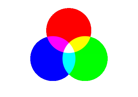

Primary colours are colours that cannot be made by mixing other colours so Red, Blue and Green - some people will say Red, Blue, Yellow, Secondary colours are made by mixing primary colours so Yellow or Green, Magenta (purple) and Cyan (light blue). Tertiary colours are made by mixing secondary colours - you can see them on the colour wheel images...
There are various ways to build a colour scheme that works. This page looks at the link between colours and emotions and this page looks at different theories based around the colour wheel.